Wattenmaker Advertising
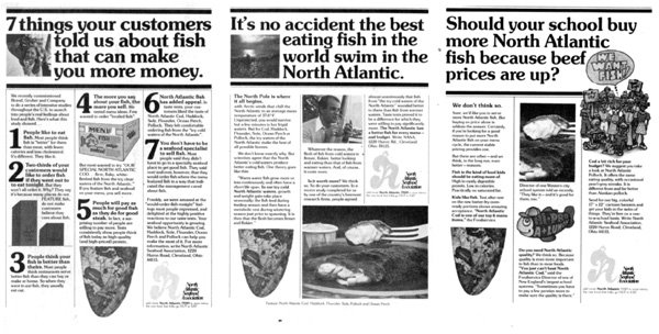 Art directors tend to use the same basic design for each ad in a series in order to hold the ads together. But that does not mean that the ads have to look exactly alike. In this series, designer Terry Dwyer always puts a long headline at the top with doubleline rules. He incorporates one piece of art with each headline and scatters other pieces in the body copy below. In two cases he uses square photographs with his headlines; in the third he uses cartoon art that stretches down low into the third column of copy. The logo does not always fall at the lower right-hand corner of the page. Two of the ads start their copy with boldface subheads or lead-ins. One starts with ordinary copy. These ads were directed to restaurants and schools in a position to order fish for their customers or students. Wattenmaker Advertising, Cleveland, was the agency; North Atlantic Seafood Association was the client. Linda Masterson wrote the copy.
![]()